
- Client
- A.T. Still Univeristy
- Role
- Project Management, Competitor Research, Web Design, Web Development
- Tool
- Figma, WordPress, Advanced Custom Fields
- Tech Stack
- HTML, CSS, JavaScript, PHP
Overview
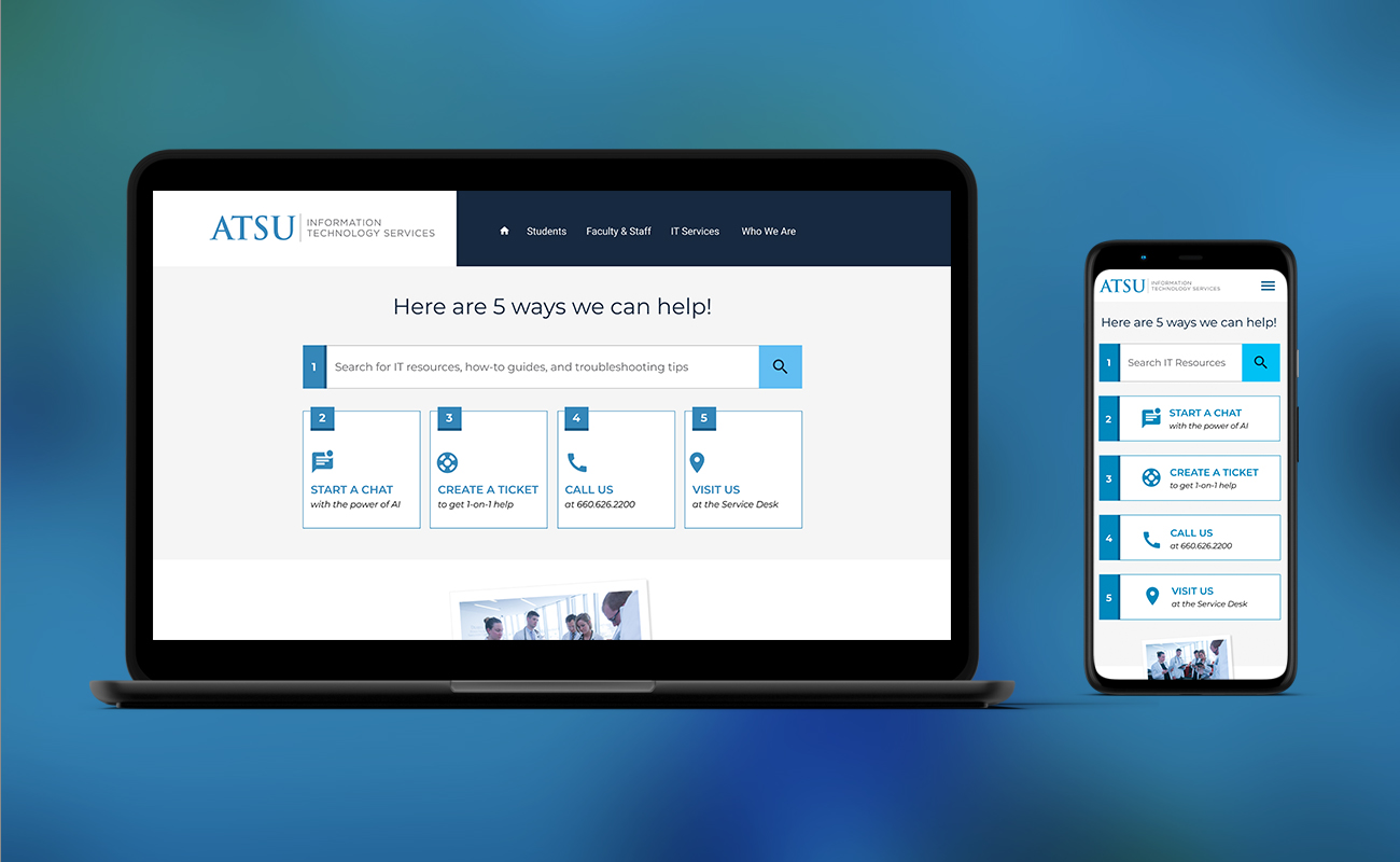
This was my second redesign for the department — the first had already solved the sprawling Google Site problem years earlier. This time, a university-wide rebrand had left the site out of compliance with new logos, colors, and fonts, but the rebrand was really the occasion, not the actual work: the site had drifted back toward being organized around IT’s internal org chart rather than around the people using it. I reorganized content by persona (students, faculty, staff) instead of org chart, simplified the navigation down to what people actually used, and rebuilt the entire site as a WordPress block theme. The result was a site that both met the new brand guidelines and was materially easier to navigate and maintain than what it replaced.
What I Owned
As the university senior web developer, I owned the project from strategy through launch, handling stakeholder and project management, competitor research, information architecture, wireframing, design, and development. I redesigned and rebuilt the site as a custom WordPress block theme using HTML, PHP, JavaScript, and CSS, with Advanced Custom Fields and custom blocks/block variations to create a more flexible and maintainable site.
The Problem
The tension wasn’t visual compliance — that was straightforward. It was that the site’s information architecture had quietly regressed toward mirroring how IT organizes itself internally, which meant users were expected to know which sub-department owned their problem before they could find help for it.
Process
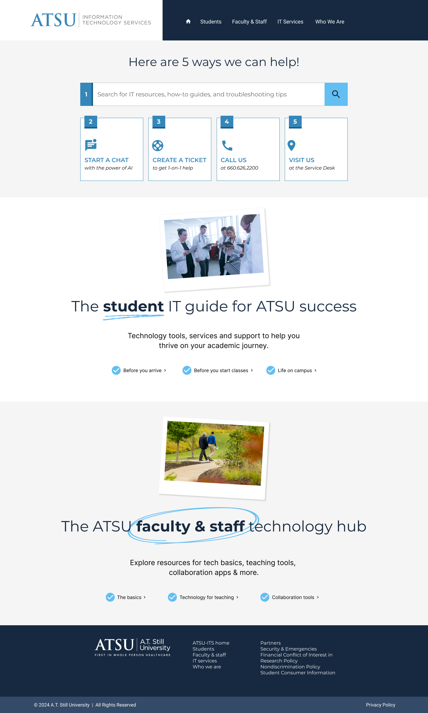
I started by looking at how the existing site organized content and reorganized it around the audiences the department serves — students, faculty, staff — and let branding compliance happen as a byproduct of the rebuild rather than the goal of it. From there I worked through what those personas actually needed: a way to solve their own problem quickly, and a fallback when self-service wasn’t enough. I also audited existing navigation and traffic to identify what to cut versus what to restructure, then designed new persona-specific landing pages organized around each group’s actual lifecycle at the university rather than IT’s service catalog.
Key Design Decisions
- Reorganizing by persona instead of by sub-department — the previous structure asked users to already know which IT team owned their issue; organizing by student/faculty/staff meant they only had to know who they were.
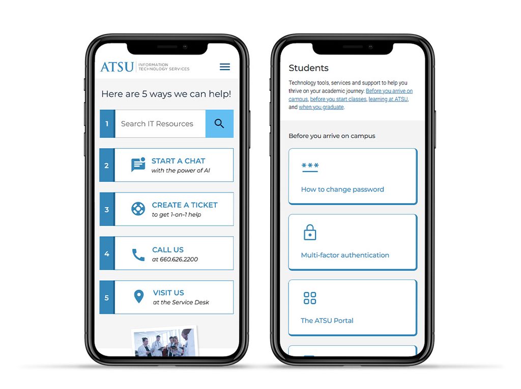
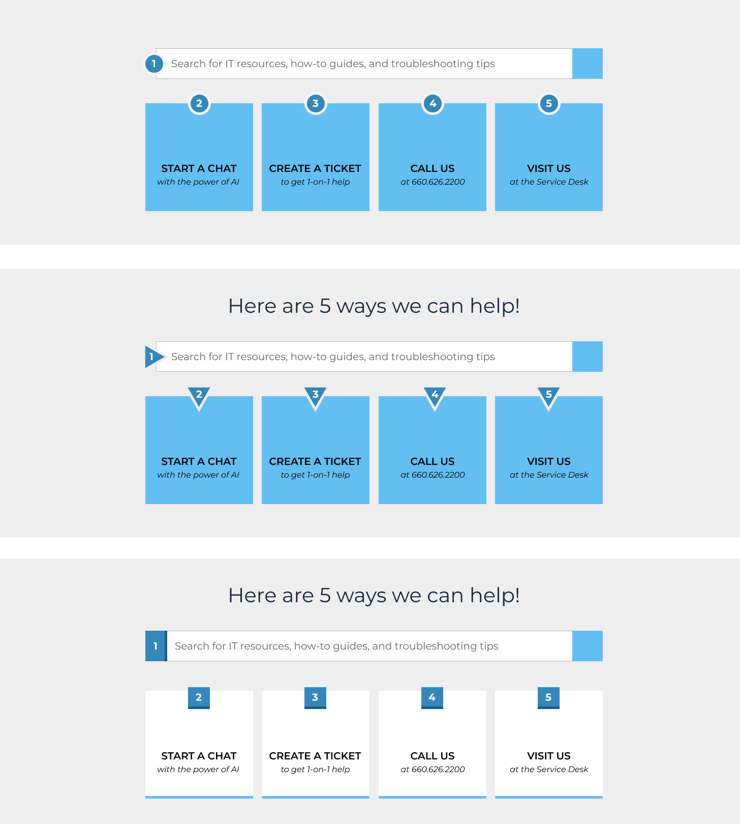
- “5 Ways to Get Help” as a dedicated pattern — balanced steering users toward self-service against still surfacing tickets, phone, and in-person options, rather than burying live-support paths behind a self-help-only design.
- Cutting low-value navigation items (Deals & Discounts, News) — these had low traffic and low utility for the core personas; removing them narrowed the nav to what people actually used instead of what had simply accumulated over time.
- Lifecycle-based landing pages for students (Before you arrive → Before classes start → Life on campus → Learning at ATSU → Graduation) — matched content to the actual sequence of a student’s IT needs over time, instead of a flat list of services.
- Rebuilding as a WordPress block theme with custom blocks and block variations — gave the department a consistent look enforced at the theme level, while making the site editable directly in WordPress without code — directly addressing the risk that another rebrand or reorg would require developer time again.
Focusing on Personas not Org Charts
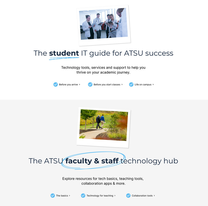
Instead of organizing the website by the department organization chart, which required users to already know which team owned their issue, I reorganized it by persona—student, faculty, or staff – so people only needed to know who they were, not who to ask. For students specifically, I built lifecycle-based landing pages that followed the actual sequence of their IT needs over time (Before you arrive → Before classes start → Life on campus → Learning at ATSU → Graduation), replacing a flat list of services with content that matched where they actually were in their journey. For faculty & staff, their content was built around the kind of work they do or the problem they might be having.
Visual Exploration
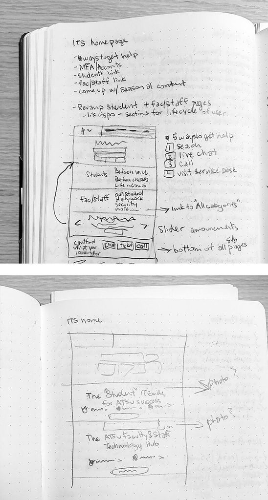
As with all website projects, I started in my sketchbook, then in Figma, exploring different design ideas. In this project, since I’d previously redesigned this website, I had years of previous designing thinking poured into this project, so I already had a good idea of what I wanted to accomplish, hence fewer design variations at this stage.
Outcome
The rebuilt site is a fully block-based WordPress theme, giving the department both brand consistency across pages and the ability to edit content and adjust blocks directly in WordPress without touching code — solving not just the immediate branding gap but the maintainability problem that had let the site drift out of compliance in the first place.