
- Client
- A.T. Still Univeristy
- Role
- Project Management, Competitor Research, Web Design, Web Development
- Tool
- Adobe XD, WordPress, Advanced Custom Fields, miniOrange SSO
- Tech Stack
- HTML, CSS, SASS, JavaScript, PHP
Overview
ATSU’s HR site had grown into an unstructured Google Site — scattered navigation, duplicate and orphaned pages, and no clear owner for keeping policy documents current. Benefits information was fragmented across multiple outdated pages, and there was no dedicated space for time-sensitive announcements — a serious gap heading into COVID-19 at a higher-ed medical institution. I rebuilt the information architecture from analytics and top-task research, consolidated duplicate content into single sources of truth, and introduced a homepage content slider for urgent updates. The result was a site employees could actually navigate, with a built-in mechanism for surfacing critical announcements when it mattered most.
What I Owned
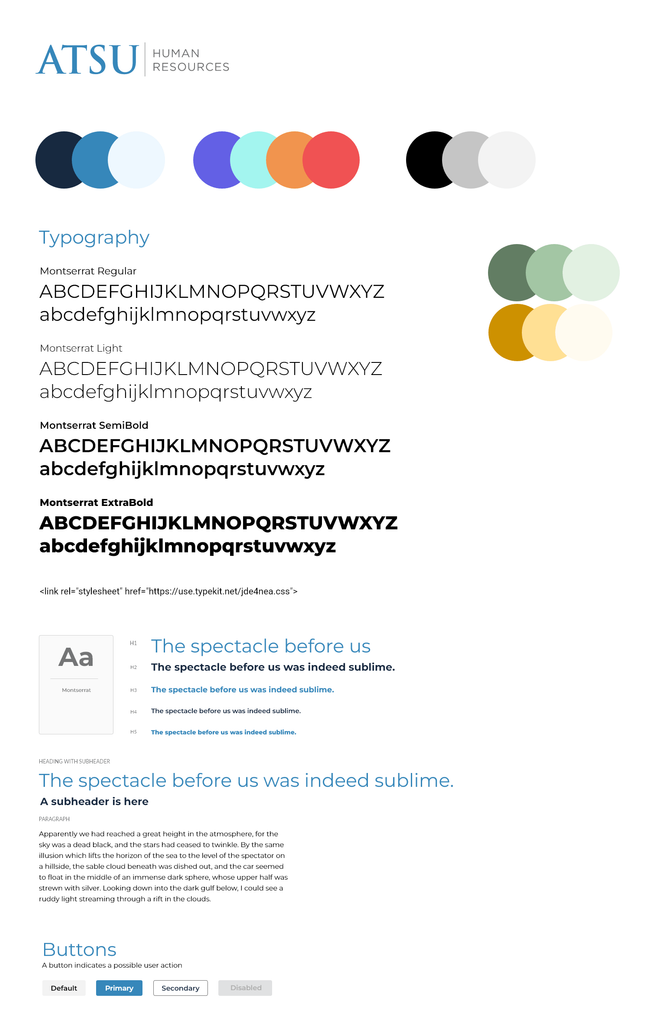
As the university senior web developer, I owned the project end-to-end, including stakeholder and project management, competitor research, information architecture, wireframing, visual design, WordPress development, and launch. I designed and built the site from the ground up, developing a custom WordPress theme with HTML, PHP, JavaScript, and SASS/CSS, along with Advanced Custom Fields and university single sign-on integration.
The Problem
The real challenge wasn’t just messy navigation — it was that content had no owner and no single home. The same policy could live on three different pages in three different states of accuracy, and there was no structural way to prevent that from happening again once the site relaunched.
Process
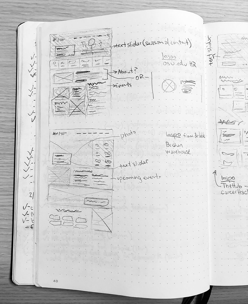
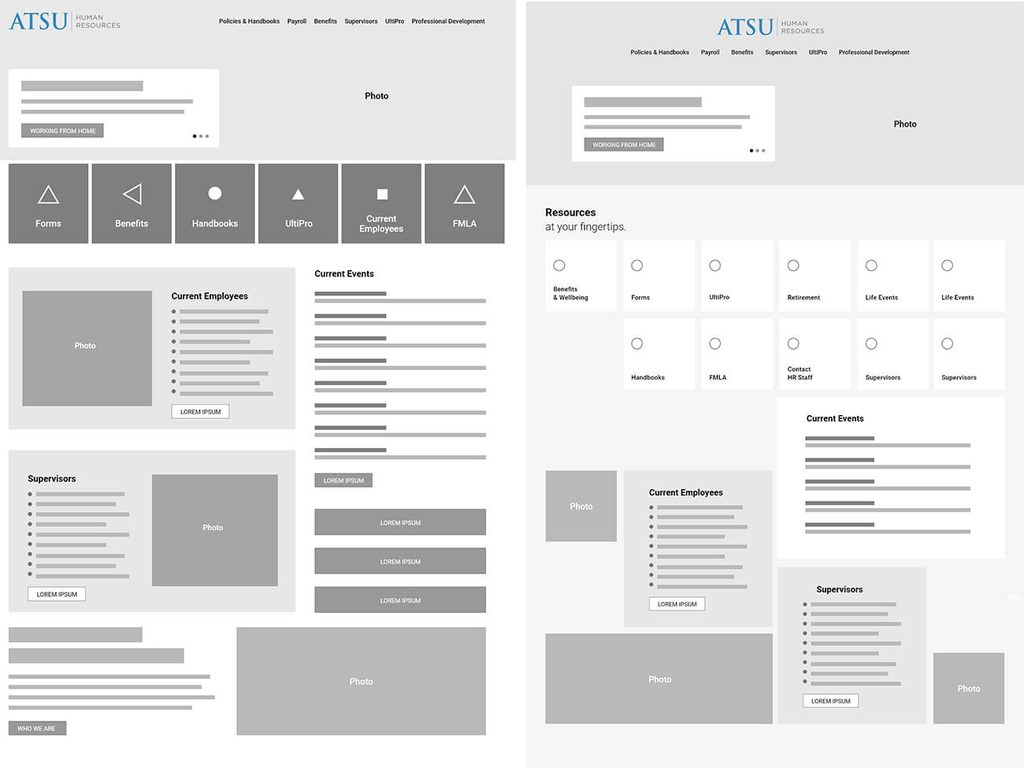
I started with the existing site’s analytics rather than a fresh content audit, since I wanted the new IA to reflect how employees actually used the site, not how it was originally organized. That data — combined with a full inventory of every existing page — became the basis for an information architecture exercise: grouping content into a structure that matched how university employees thought about it, not how it had accumulated over time. A key shift during this process was applying Gerry McGovern’s “top tasks” methodology to the homepage: instead of designing the homepage around organizational categories, I designed it around the handful of things employees actually came to the HR site to do. That same top-task thinking cascaded down to second- and third-level pages — each one built around a single topic with its priority action surfaced first, rather than treating every page as a flat container for related information.
Key Design Decisions
- Consolidating duplicate content into single sources of truth — rather than redesigning pages in place, I merged overlapping content so each topic (e.g., benefits) had one authoritative page instead of several inconsistent ones.
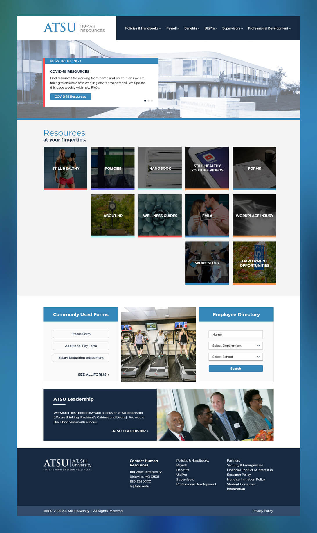
- Structuring the homepage around top tasks, not an org chart — analytics showed what employees actually needed on a given visit, so the homepage was built to answer that rather than mirror HR’s internal department structure.
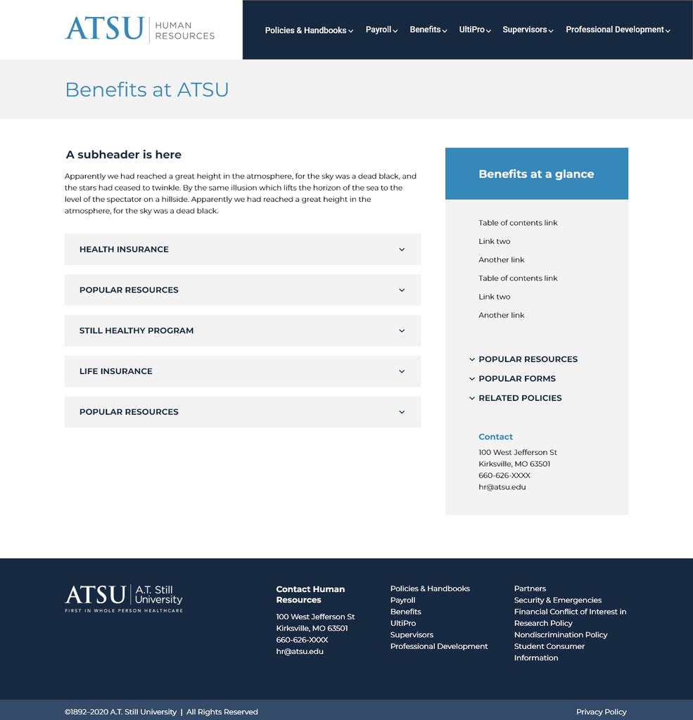
- One topic per page, with the primary call-to-action prioritized — this kept each page scannable and made it obvious what action a visitor should take, instead of burying it under exhaustive department information.
- Sidebar of related resources on most pages — handled the edge case of tangentially related information without diluting the page’s single-topic focus or forcing users to hunt through navigation.
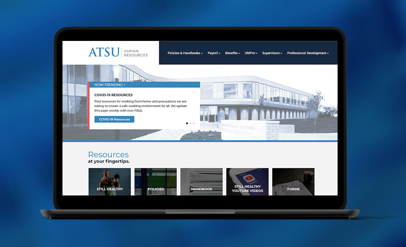
- Homepage content slider as a dedicated announcement channel — the old site had no reliable place for urgent, time-sensitive updates; the slider gave COVID-19 policy changes a single, visible source of truth for students and employees during a period when policies were changing constantly.
Outcome
Post-launch, I used site search data and analytics to validate and refine the design — the “Resources at Your Fingertips” tiles were reorganized based on what employees were actually searching for, confirming the top-task assumptions the redesign was built on and giving a clear path for iteration rather than guessing at what to fix next.