
- Client
- A.T. Still Univeristy
- Role
- UX Design & Project Lead — Stakeholder Research, Competitive Analysis, Wireframing, Interactive Prototyping
- Tool
- Figma
Overview
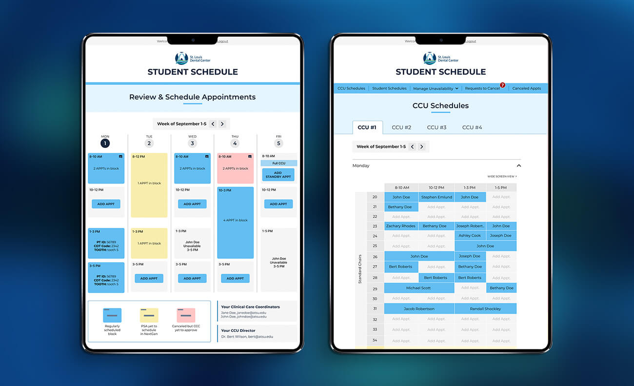
A.T. Still University’s dental teaching clinic has more student dentists than patient chairs on any given day. For years, scheduling ran on a shared spreadsheet anyone could edit — a system that produced constant double-bookings, overwritten appointments, and frustration on both sides of the chair. I led the UX design for a purpose-built scheduling platform to replace it, partnering with the school’s in-house technologist and an outside development team to bring it to life.
What I Owned
I owned the UX design from research through final prototype, handling stakeholder research, competitive analysis, information architecture, wireframing, and interactive prototyping in Figma. After stakeholder sign-off, I worked closely with a third-party developer to see the project through to launch.
The Problem
Patient chair capacity is fixed; demand isn’t. On top of that basic constraint, the clinic needed one tool to serve several groups with very different needs and permission levels — student dentists booking their own patients, patient advocates coordinating appointments, supervising dentists tracking their oversight load, faculty needing visibility without edit access, and administrators managing chairs and system-wide access. The solution had to make each of those views feel purpose-built, not like one crowded interface with settings toggled on or off.
Process
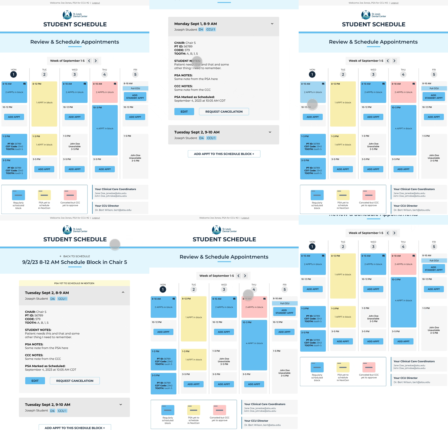
I started with the student’s view first, since it was the highest-volume, highest-stakes use case: I asked the team and myself: what does a student need to see and do the moment they log in?
That question led to weekly working sessions with school stakeholders — sketching, wireframing, and iterating in Figma — over a tight four week timeline. Each round tightened the scope: how appointment blocks should display, how to signal a fully booked slot versus one with overflow options, how permission levels should shape what each role could see or touch. The project closed with a walkthrough of interactive prototypes for school leadership, who signed off with only minor revisions.
Key Design Decisions
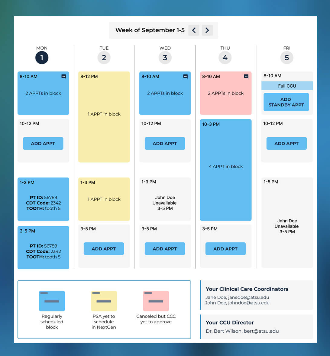
- I used a weekly grid as the student home view. An hourly calendar grid, rather than a list, gave students an at-a-glance read on their own availability and open chairs — the two things they needed constantly.
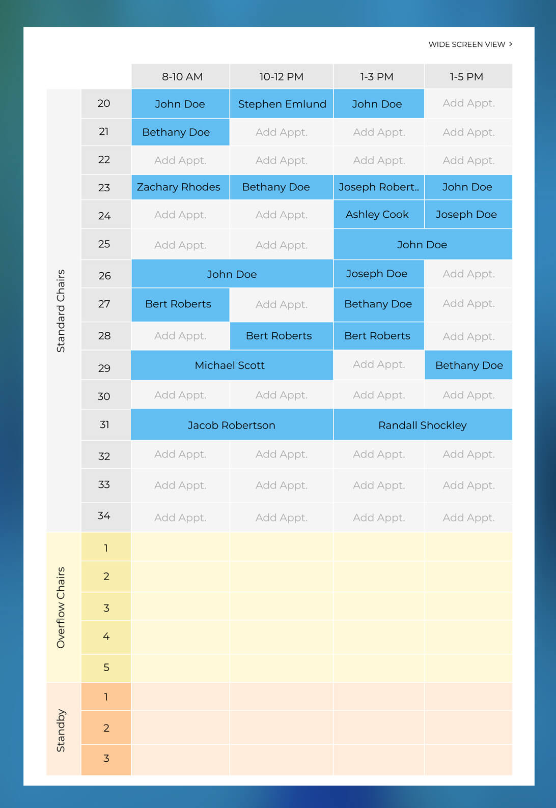
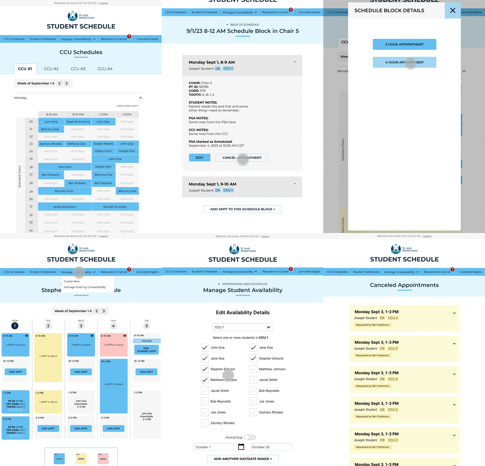
- I used a daily grid showing chair/time/student for cohort leaders so they have a broad overview of the clinic patient load on a daily basis.
- Role-based views instead of permissions bolted onto one screen. Students, patient advocates, supervising dentists, faculty, and admins each got an interface scoped to what they needed to do, rather than a shared view with controls hidden or disabled depending on who was logged in.
- Designing for the edge case, not just the happy path. Chairs are grouped and restricted to specific student cohorts, appointments run in fixed blocks with procedure-level detail attached, and a fully booked time slot still needed a path forward — overflow chairs or standby appointments — so a cancellation or no-show didn’t waste clinic time. Handling that well, without cluttering the core booking flow, was most of the actual design work.
The Student View: Weekly + Hourly Schedule as a Landing Page
I used a weekly grid as the student view. It’s an hourly calendar grid, rather than a list, giving students an at-a-glance read on their own availability and open chairs — the two things they needed constantly. This also lets them easily add appointments in open timeslots.
Interactive Figma Prototype of the Student Experience
The Cohort Leader View: Daily + Hourly + Dental Chair Schedule
I used a daily grid showing chair/time/student for cohort leaders so they have a broad overview of the clinic patient load on a daily basis. These leaders have oversight and management duties on the daily schedule. They can quickly see which students have appointments in which dental chairs and where there are open times and chairs to slot last minute patients in.
Interactive Figma Prototype of the Cohort Leader Experience
Outcome
Leadership approved the design and interactive prototype after a single round of revisions, and it became the direct foundation for the developers to work from. When the scheduling web app launched, staff and students reported having more clarity about how to manage their schedules as well as have more clarity on what was scheduled on a daily or weekly basis.