
- Client
- City of Kirksville, MO
- Role
- Project Management, Competitor Research, Wireframing, Web Design, Web Development
- Tool
- Photoshop, WordPress, Advanced Custom Fields
- Tech Stack
- HTML, CSS, JavaScript, PHP
Overview
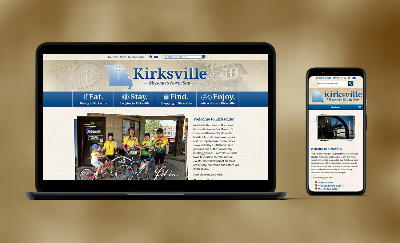
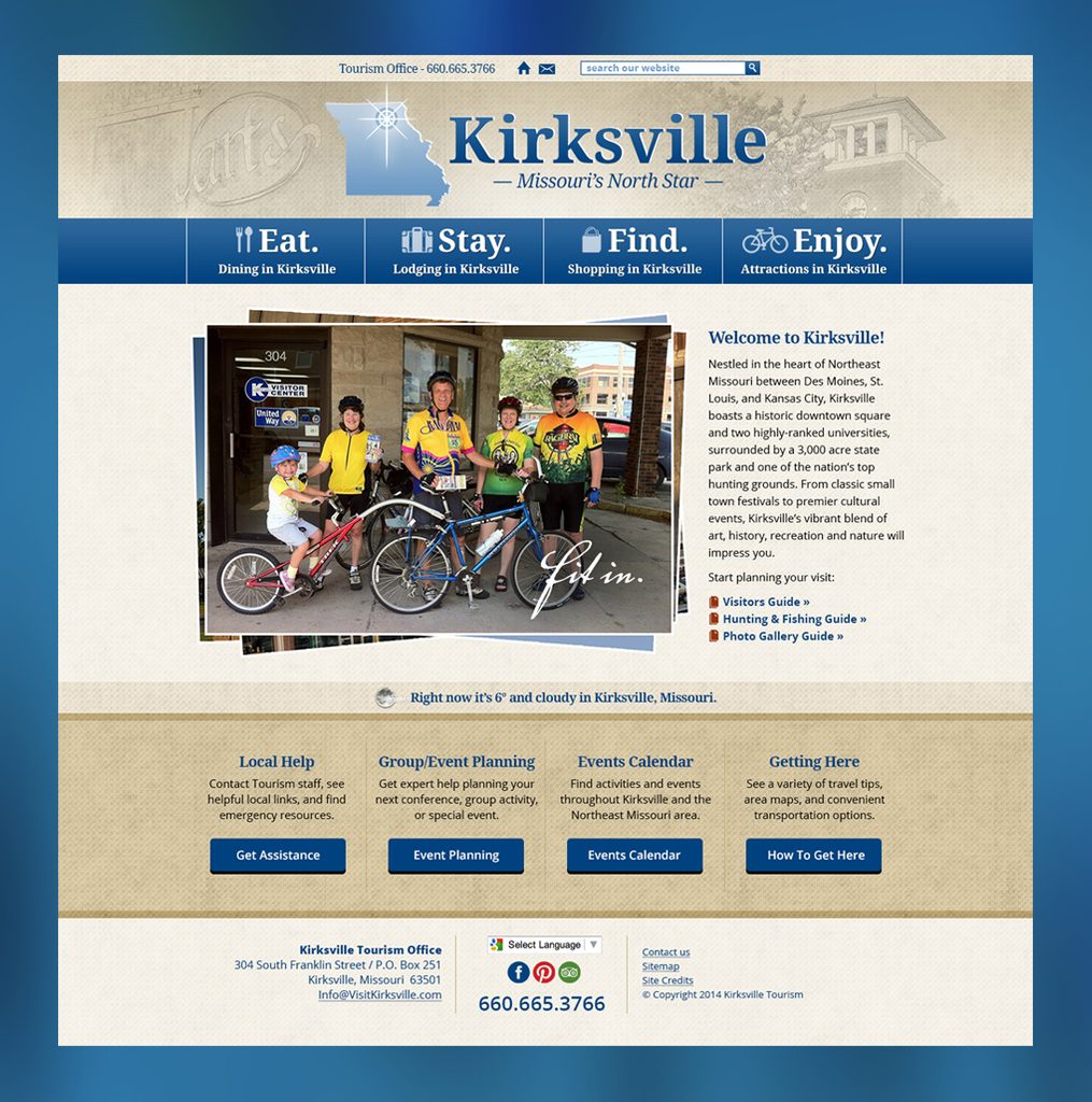
The city wanted a full redesign of their old and outdated tourism website. The website style and branding needed a refresh to reflect the personality of the city of Kirksville. Editing the website was difficult and ease of maintenance was a priority.
The Problem
The old website had a visual identity that reflected a nighttime, interstate highway vibe. The unique character of Kirksville — a small, multi-college town with a beautiful downtown, a breathtaking state park and vibrant annual festivals — wasn’t reflected and needed to be front and center through photography, visual branding and landing page content.
There was a second problem underneath the first one. The previous site had become effectively un-editable by the people who owned it, and nobody wanted to repeat that. So the real brief wasn’t “make it beautiful.” It was “make it beautiful and make it something a two-person tourism office can still run five years from now.” Before I had a signed contract, I recorded a short screencast showing what editing a well-built WordPress page actually looks like. That video is why the project became a custom design instead of a template.
Process
I worked through a project manager the tourism office had brought in from outside. Designing through a proxy forced a communication discipline I’ve kept: I had to explain every idea clearly enough that a non-designer could carry it into a room I wasn’t in and defend it without me.
Research came first, and it changed the work. My stakeholder survey mixed straight business-goal questions with metaphor questions — if Kirksville were a car, an instrument, a fabric — and the metaphors did what the direct ones couldn’t. The Tourism Director answered that Kirksville would be “a violin, because it can play classical music and it can be a fiddle and play bluegrass and country.” That became the compass: ultra-modern would be wrong for this town, and so would rustic. Kirksville is both. I also questioned an assumed audience of “40 to 60 year olds,” and checking it surfaced better data and a sharper persona — a thirty-or-forty-something mom planning the family’s trip. A competitive review turned up the same violin idea in the town’s own words: “everything from the county fair to the symphony orchestra, tractors to BMWs, and canning jars to confocal microscopes.”
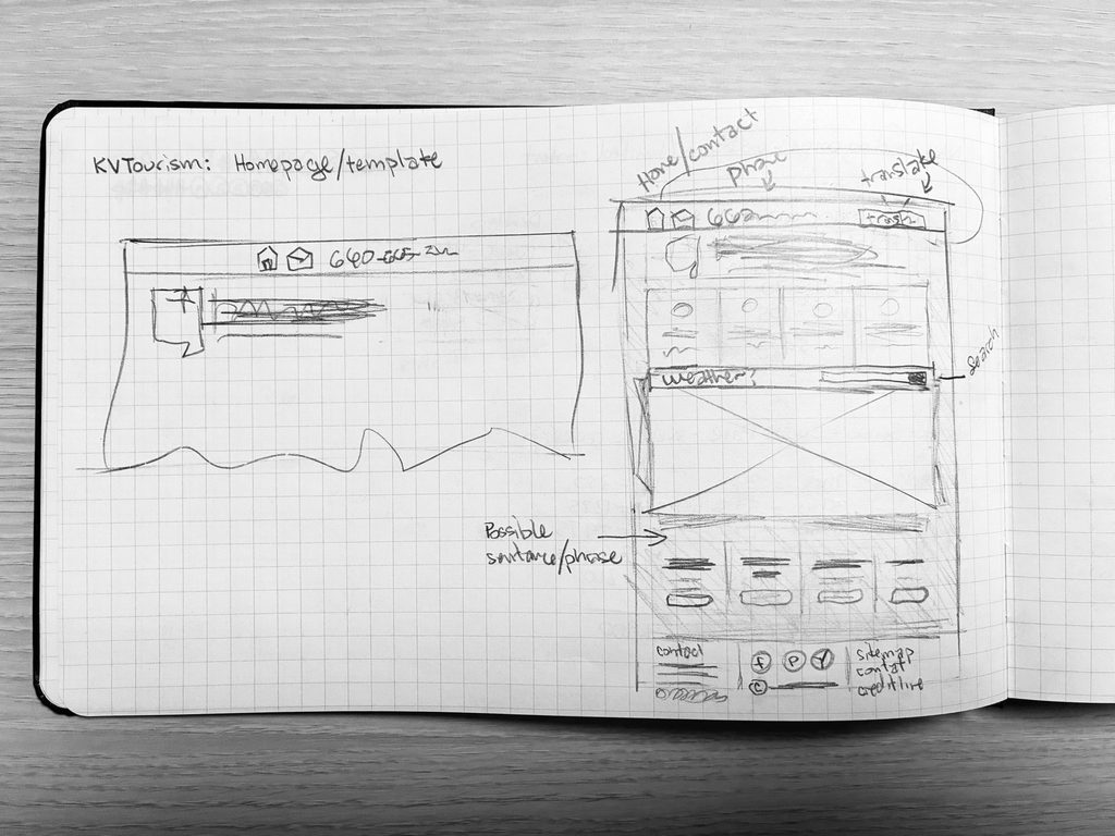
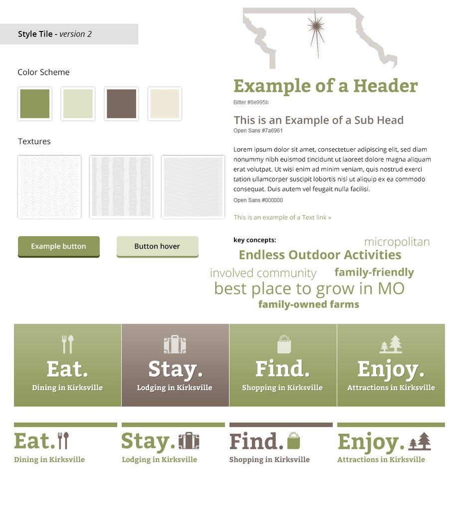
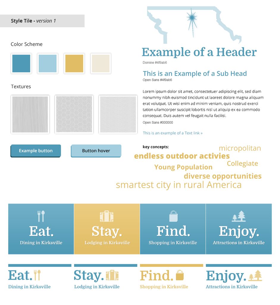
From there: style tiles, then a homepage and one subpage in Photoshop, then eight rounds of versioned mockups. Visual revisions kept running while I was already coding the WordPress theme and building the editing infrastructure. It was never a clean waterfall of research → design → development → launch, and the overlap made the product better. Because this was freelance work on nights and weekends while my client worked business hours, everything had to stand on its own — recorded walkthroughs, versioned comps, written rationale.
Key Design Decisions
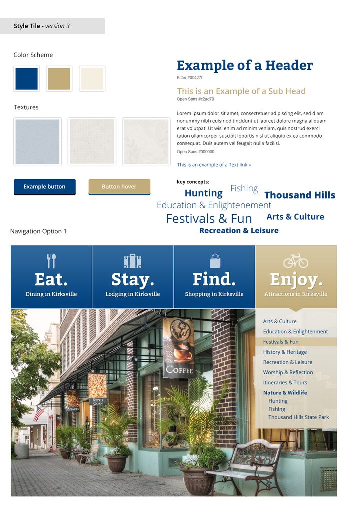
- A deliberately quiet palette. Deciding on a color scheme and fonts was the driving force behind getting design approval. The brief was a palette that would blend with the colors already in play around town — the purple, blue, orange and black of the colleges, the high school and the city’s own materials — without competing with any of them, and without reading as a full color scheme on its own. We landed on a deep, desaturated blue (
#00427F) with a warm tan (#D6C7A2) and an off-white body. Why: a tourism site is a frame for other people’s photographs, festivals and campuses. A saturated brand blue would have fought every image placed on top of it. - Four verbs. Navigation was chosen as EAT / STAY / FIND / ENJOY with supporting icons and a subheading. This is the decision I’m proudest of, because it outlived the site — see Outcome.
- Purpose-built editing screens instead of a page builder. Every content type got its own custom Advanced Custom Fields interface: an “Add New Restaurant” button on the dining page, a repeating lodging block with a checkbox that turns on a booking link, a gallery entry with a tagline field. Why: a general-purpose page builder gives non-technical staff enough freedom to break the layout. A purpose-built form makes the correct result the only available result. Partway through, my client asked me to remove a tagline-position control because she found it confusing — and taking that option away was straightforwardly the right call. More flexibility means more ways to get it wrong and more to test every time something new is added.
- A rotating header that couldn’t play favorites. The header used hand-sketched Kirksville line art in rotating pairs — deer and pontoon boat, bell tower and arts, violin players and round barn. Why: Kirksville is diverse with two colleges and several annual events. Showing just one image is playing favorites, not a design choice. And when the available photography wasn’t strong enough to carry the design, I licensed a set of my own photographs to the city rather than ship weak imagery.
Outcome & Reflections
The site ran in production for more than eight years, from May 2014 through January 2023. It was handed across four successive tourism staff in that time — and every one of them picked it up and ran it without a rebuild or a retraining project.
Two habits from this project show up in everything I’ve built since.
- Show the work in progress, not the reveal. My instinct then was to disappear and come back with something finished. My client told me plainly that she hated surprises and wanted to be treated as a resource rather than an audience — and she was right. Versioned mockups and recorded walkthroughs turned review from a verdict into a conversation, and the design improved every time I shared earlier than felt comfortable.
- Translate feelings into decisions instead of asking for specifications. At one point I was asked for a “warmer white-on-white,” which I couldn’t parse as a color instruction. What unlocked it was a list of textures: linen, sand, parchment, violin wood. I stopped asking clients to speak design and started listening for the metaphor.